Design Tips
Thoughtful Layout – how to design a banner.
Struggling with banner inspiration? We’ve got some handy advice…
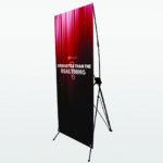
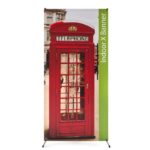
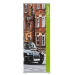
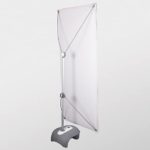
X Banners and L Banners, are a key marketing tool for any exhibitor or trader. They can be used to draw in potential customers to
your stand or business, and be used to share vital information. Therefore, the design of them is just as important as your other marketing collateral – leaflets, brochures, adverts etc. The layout of the design should be thoughtful, simple and eye catching. The mobility, compact-ability and reusability of an x-banner gives you the flexibility to take your brand on the road and have a key piece of marketing with you at all times.
Designing an x banner is just like designing a poster. It requires thought and should match your other marketing items. Always on brand and attractive to the eye – up close and from afar. Often available in a selection of heights and widths, a banner is usually long and thin in nature.
The standard design layout lends itself to our design in thirds rule: Key message; content; contact details. With this rule of thirds in mind, we asked our studio to share a few top tips with you. Below they share some top tips and answer some frequently asked questions.


How do you set up banner artwork in InDesign?
It’s not rocket science – very important first step. Use one of our xstand templates to make sure your measurements and proportions are correct and match the product you are ordering. We’re taking the hassle out of page set up and you can find templates for our full range online.
Where should I place my logo on my banner design?
Top logo – placement of your logo is simple. Pop it at the top of your x banners! Eye catching and visible from a distance, its positioning let’s everyone know that the information to follow has been prepared by you for them. Positioning your logo at the top of your design creates instant brand recognition and should tie in nicely to your other marketing collateral.
What is the best position for my key message in my design?
Key message at eye level – it’s important that your key message is at eye level and joins your logo in the top third of your design.
Whether this is your slogan or a product image, it will be the key piece of information seen after your logo.
Where should my body text be placed on my banner design?
Text left to right – we all read left to right. Your potential customers are no different. So don’t make reading your banner hard for them. Disjointed and random layouts of text can cause confusion, and in turn your overall message or impact can be lost. Align your text, keep sentences short and layout text to be read left to right. Text should be placed in the middle third of your design.
How many types of font should I use?
Font styling – try not to use more than two different fonts in your design. Keep it simple for maximum readability.
Image placement is important, where should it be placed on my design?
Imagery – if you are going to use imagery in your L or X stand banner design, then make sure it is high resolution enough to be printed. See our artwork setup guide for more inforation. Make sure imagery does not obstruct any text. It can be tempting to place large point size text over the top of an image; however, this often makes text hard to read. Text and/or imagery should be placed in the middle third of your design.
I have a lot of white space, what else can I add to my design?
White space is friendly – leave lots of white space around your text allowing it to breath and remain clear. It also allows our eyes resting time when reading, it aids comprehension.
What contact details should I include on my banner design?
Double check that website – be sure to point readers to another source for more information. This will be your bottom third of your floor banner stands. This can simply be your contact details including an email and telephone number, or simply your website. Double and triple check grammar and spelling. If your telephone number is printed incorrectly then your telephone is not going to be ringing after your exhibition or event.
Can I include social media icons on my banner design?
Be social – social media icons and hashtags can also be added but don’t overcrowd the space. We recommend you use between one and three pieces of contact information in total. This should sit in the bottom third of your design.


How much space to I need to leave at the bottom of my artwork?
Roll to the floor – remember that you need to allow space at the bottom of your banner for the printed graphic to be attached to the cassette hardware of your banner. This is outlined in on our templates and in our guidelines. Keep text and key information away from the bottom of your design. Remember, your customers are likely to be standing, therefore they are not likely to read information that is displayed too close to the floor.
Top Tips Summary
- Use a template
- Logo at the top
- Key message at eye level
- Layout text left to right
- Only use two fonts
- Consider image placement
- White space is important
- Check contact details
- Use social media icons
- Leave space at the bottom
Once you have designed your banner, double checked all of the information and created a high-resolution PDF – your design is ready.
Need help with preparing your design?
Get in touch for expert advice and support today